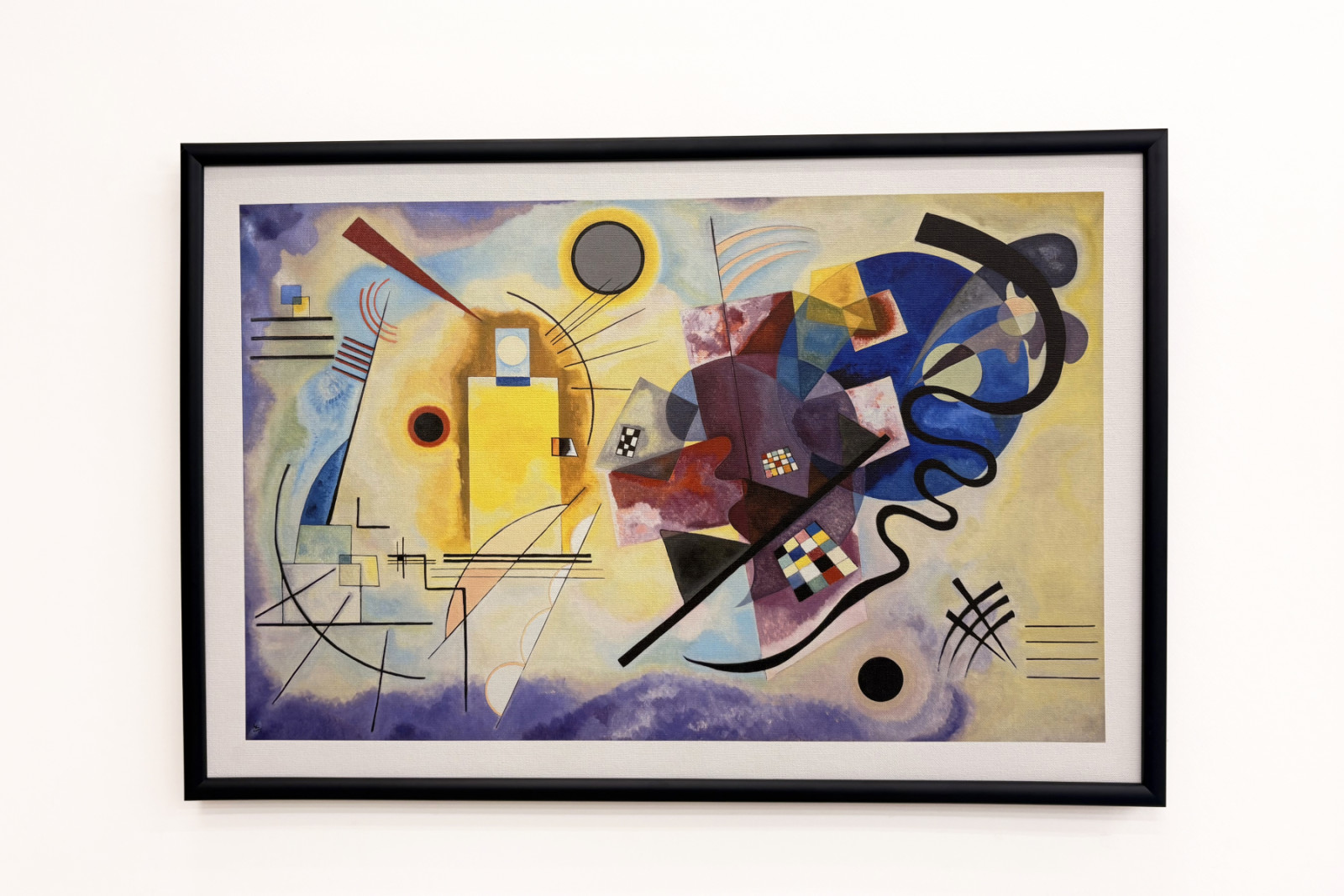
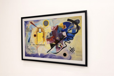
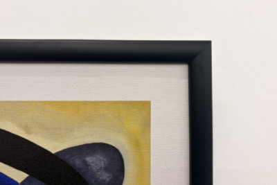
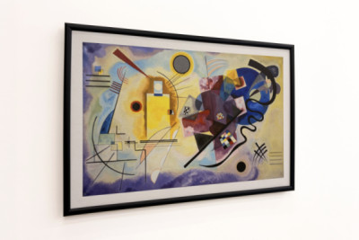
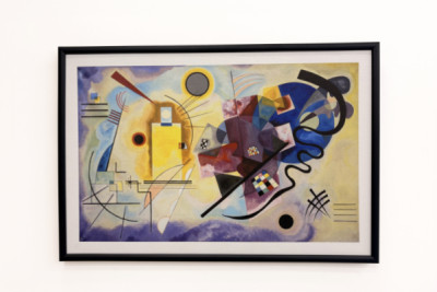
A wide white border surrounds the composition here, before the black frame encloses it - and it is precisely this zone of tranquillity that does the picture good. For what Kandinsky brings to the canvas in 1925 is anything but still: yellow, red and blue do not simply stand side by side; they appear as different forces working against one another amongst circles, lines and geometric shapes. On the left, the radiant, almost floating yellow with its delicate clusters of black lines; on the right, the heavy, self-circling blue; in between, the red wedge and a tangle of chequerboard squares, arcs and a curved black line that winds its way through the right-hand half of the picture like a thread. I find the light border particularly fitting here, as the motif itself already contains so much colour and movement and thus creates a bit of distance from the black of the strip. Kandinsky, born in Russia in 1866, understood colour as something in its own right, with emotional and rhythmic impact - not as a means of depicting objects, but as a sound that stands on its own. ‘Yellow - Red - Blue’ was created during his time at the Bauhaus and is regarded as one of his most focused explorations of precisely this idea.
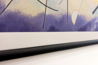
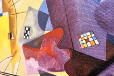
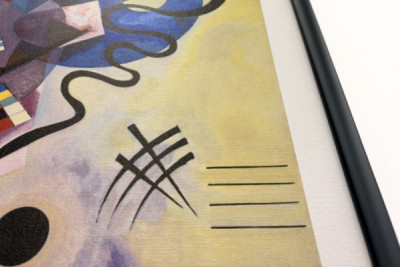
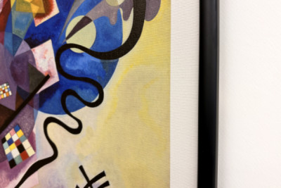
The eye is drawn to a tiny detail to the right of the centre of the picture: a mosaic of perhaps twenty small coloured squares on the violet field, each barely the size of a fingernail. The print renders each one of them cleanly separated - turquoise next to orange next to pink, with crisp edges, whilst right next to it the soft, cloud-like gradients of violet flow seamlessly. The fact that both elements - the hard surface and the washed-out mist of colour - work side by side speaks in favour of the satined ‘Leonardo’ canvas, which also renders the black lines against the yellow background with razor-sharp precision. Friedegarde, a narrow black strip, does not interfere with the colour scheme - the frame instead serves as a bridge to the era from which the work originates. The wide landscape format allows the many forms space to coexist side by side. Despite all the bustle, the composition never descends into chaos; it remains remarkablystrangely balanced - and when daylight sweeps across the surface from the side, the subtle satin sheen enhances the yellow once more, without reflecting the dark areas. This is exactly how it’s meant to look.
 ×
× 





 +43 4257 29415
 support@meisterdrucke.com
 Mo-Do: 7:00 - 16:00 | Fr: 7:00 - 13:00