 (Egon Schiele)")
support@meisterdrucke.com · 0043 4257 29415


.jpg "Wisteria by Claude Monet")
.jpg)
.jpg "Yellow journey by Charlie Millar")
.jpg)
.jpg "Universal I, 2003 Orb abstract by Lee Campbell")
.jpg)
.jpg "The Sacred Spiral by Jane Deakin")
.jpg)
.jpg "The Happy Dots 1, 2014 by Nancy Moniz Charalambous")
.jpg)
 - (MeisterDrucke-217706).jpg "Earth Crisis by Ikahl Beckford")
 - (MeisterDrucke-217706).jpg)
.jpg "Valley of the Waterfalls by Jane Deakin")
.jpg)
.jpg "South, 2000 Abstract Landscape by Lee Campbell")
.jpg)
 - (MeisterDrucke-38211).jpg "The Talisman, or The Swallow-hole in the Bois d")
 - (MeisterDrucke-38211).jpg)
_-_(MeisterDrucke-373206).jpg "Landscape in Pink by Alex Caminker")
_-_(MeisterDrucke-373206).jpg)
_-_(MeisterDrucke-373438).jpg "Palette III by Alex Caminker")
_-_(MeisterDrucke-373438).jpg)
 - (MeisterDrucke-182830).jpg "Orange, 1931 by Johan Thorn Prikker")
 - (MeisterDrucke-182830).jpg)
.jpg "Oxidation II by Lee Campbell")
.jpg)
.jpg "Large Meditation X, 1937 by Alexej von Jawlensky")
.jpg)
.jpg "Colours by Alex Caminker")
.jpg)
.jpg "Just Above Sea Level by Lou Gibbs")
.jpg)
_-_(MeisterDrucke-560822).jpg "Cyanae Blue by Charlotte Johnstone")
_-_(MeisterDrucke-560822).jpg)
.jpg "Untitled blue painting, 1995 by Charlie Millar")
.jpg)
 - (MeisterDrucke-195423).jpg "Jim 5 by Scott J. Davis")
 - (MeisterDrucke-195423).jpg)
 - (MeisterDrucke-244096).jpg "Abstract Composition by Lou Gibbs")
 - (MeisterDrucke-244096).jpg)
 - (MeisterDrucke-209849).jpg "One World by Charlie Millar")
 - (MeisterDrucke-209849).jpg)
.jpg "The Happy Dots 2, 2014 by Nancy Moniz Charalambous")
.jpg)
 - (MeisterDrucke-157262).jpg "Anticipation by Lou Gibbs")
 - (MeisterDrucke-157262).jpg)
.jpg "The Happy Dots 6, 2014 by Nancy Moniz Charalambous")
.jpg)
 - (MeisterDrucke-297081).jpg "Still Life with Apples by Alexander Bogomazov")
 - (MeisterDrucke-297081).jpg)
.jpg "Composition I by Patrick Henry Bruce")
.jpg)
.jpg "The Happy Dots 8 by Nancy Moniz Charalambous")
.jpg)
.jpg "Abstract 60 by Sara Hayward")
.jpg)
_-_(MeisterDrucke-373410).jpg "The Late Afternoon Time in the Field by Alex Caminker")
_-_(MeisterDrucke-373410).jpg)
.jpg "Etude #6 by Alex Caminker")
.jpg)
.jpg "Animal Destinies by Franz Marc")
.jpg)
_-_(MeisterDrucke-373204).jpg "Sketch #1 by Alex Caminker")
_-_(MeisterDrucke-373204).jpg)
.jpg "Large Meditation, 1937 by Alexej von Jawlensky")
.jpg)
.jpg "Etude #11 by Alex Caminker")
.jpg)
 - (MeisterDrucke-145031).jpg "World Ash Tree, 1999 by Charlie Millar")
 - (MeisterDrucke-145031).jpg)
.jpg "Abstract 62 by Sara Hayward")
.jpg)
.jpg "Abstract 4 by Sara Hayward")
.jpg)
 - (MeisterDrucke-268011).jpg "Greg 4 by Scott J. Davis")
 - (MeisterDrucke-268011).jpg)
.jpg "Etude #10 by Alex Caminker")
.jpg)
.jpg "Horse, from")
.jpg)
.jpg "Red and Blue by David Studwell")
.jpg)
.jpg "Magenta, 2001 by Lee Campbell")
.jpg)
.jpg "The City, 2014 by Julie Held")
.jpg)
.jpg "Etude #4 by Alex Caminker")
.jpg)
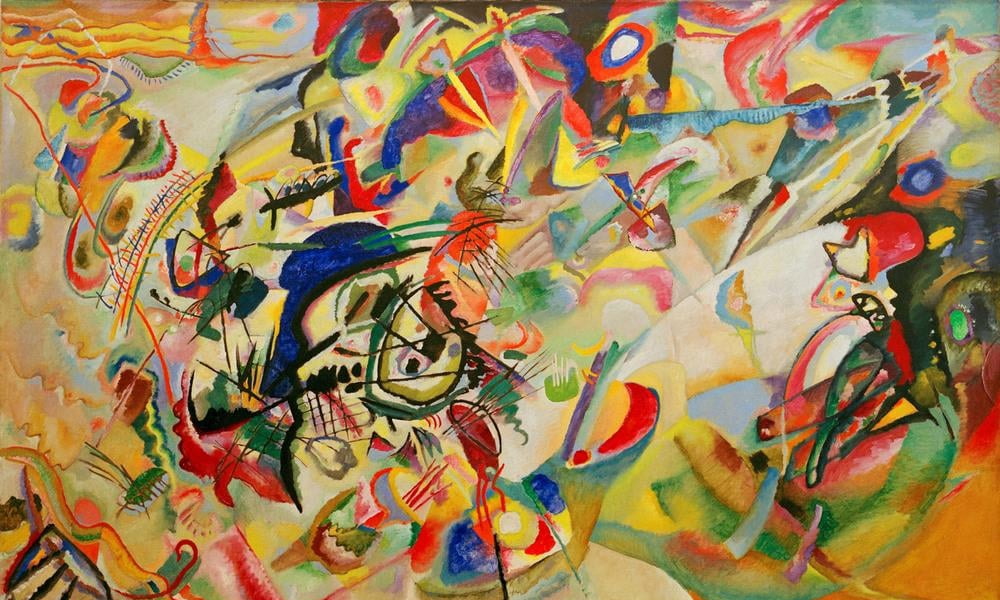
 - (MeisterDrucke-53318).jpg "Composition No. 7, 1913 (detail) by Wassily Kandinsky")
 - (MeisterDrucke-53318).jpg)
 - (MeisterDrucke-87783).jpg "Waterlilies at Sunset (detail) by Claude Monet")
 - (MeisterDrucke-87783).jpg)
.jpg "Etude #3 by Alex Caminker")
.jpg)
.jpg "Etude #1 by Alex Caminker")
.jpg)
.jpg "Etude #7 by Alex Caminker")
.jpg)
_-_(MeisterDrucke-560813).jpg "Cheese Fish by Charlotte Johnstone")
_-_(MeisterDrucke-560813).jpg)
.jpg "Etude #9 by Alex Caminker")
.jpg)
.jpg "Etude #12 by Alex Caminker")
.jpg)
.jpg "Kensington Gardens Series: Trunk by Izabella Godlewska de Aranda")
.jpg)
 - (MeisterDrucke-284725).jpg "C26 by Scott J. Davis")
.jpg "Abstract 45 by Sara Hayward")
.jpg)
.jpg "Meadow by Alex Caminker")
.jpg)
.jpg "Composition V by Patrick Henry Bruce")
.jpg)
_-_(MeisterDrucke-592345).jpg "Kensington Gardens Series: The Pool of Chaos by Izabella Godlewska de Aranda")
_-_(MeisterDrucke-592345).jpg)
.jpg "Abstract 33 by Sara Hayward")
.jpg)
.jpg "Etude #8 by Alex Caminker")
.jpg)
.jpg "Abstract 30 by Sara Hayward")
.jpg)
.jpg "Etude #5 by Alex Caminker")
.jpg)
_-_(MeisterDrucke-560821).jpg "Clown Fish II by Charlotte Johnstone")
_-_(MeisterDrucke-560821).jpg)
.jpg "Abstract 27 by Sara Hayward")
.jpg)
_-_(MeisterDrucke-560818).jpg "Purple Moon by Charlotte Johnstone")
_-_(MeisterDrucke-560818).jpg)
.jpg "Small Composition I, 1913 by Franz Marc")
.jpg)
.jpg "Everybody I Never Slept With (detail) by Lou Gibbs")
.jpg)
.jpg "Abstract 25 by Sara Hayward")
.jpg)
.jpg "Untitled by Lyubov Sergeevna Popova")
.jpg)
_-_(MeisterDrucke-373413).jpg "The Evening of February by Alex Caminker")
_-_(MeisterDrucke-373413).jpg)
.jpg "Above the City by Alex Caminker")
.jpg)
.jpg "Kensington Gardens Series: My World of Green 2 by Izabella Godlewska de Aranda")
.jpg)
.jpg "Abstract 19 by Sara Hayward")
.jpg)
.jpg "Abstract 8 by Sara Hayward")
.jpg)
.jpg "Landscape with black arch (detail) by Wassily Kandinsky")
.jpg)
.jpg "Abstract 40 by Sara Hayward")
.jpg)
_-_(MeisterDrucke-373444).jpg "Sunset by Alex Caminker")
_-_(MeisterDrucke-373444).jpg)
.jpg "Climax, 1988 by Izabella Godlewska de Aranda")
.jpg)
.jpg "Abstract 3 by Sara Hayward")
.jpg)
.jpg "Muadale Collage by Peter McClure")
.jpg)
.jpg "Mountain Fortress by Alex Caminker")
.jpg)
.jpg "Abstract 15 by Sara Hayward")
.jpg)
.jpg "Abstract 54 by Sara Hayward")
.jpg)
.jpg "Abstract 43 by Sara Hayward")
.jpg)
.jpg "Movement in Space (1917-18) by Mikhail Vasilievich Matyushin")
.jpg)
_-_(MeisterDrucke-560812).jpg "Friesian Blue by Charlotte Johnstone")
_-_(MeisterDrucke-560812).jpg)
.jpg "Abstract 24 by Sara Hayward")
.jpg)
.jpg "Abstract 53 by Sara Hayward")
.jpg)
.jpg "Geometry of Objects and Shadows by Alex Caminker")
.jpg)
.jpg "Abstract 9 by Sara Hayward")
.jpg)
 - (MeisterDrucke-146462).jpg "Angel of Delight by Patricia Brintle")
 - (MeisterDrucke-146462).jpg)
.jpg "Abstract 42 by Sara Hayward")
.jpg)
_-_(MeisterDrucke-373202).jpg "House with an Extension by Alex Caminker")
_-_(MeisterDrucke-373202).jpg)
.jpg "Abstract 56 by Sara Hayward")
.jpg)
_-_(MeisterDrucke-560811).jpg "Bluerine Green by Charlotte Johnstone")
_-_(MeisterDrucke-560811).jpg)
.jpg "Abstract 28 by Sara Hayward")
.jpg)
.jpg "Quiet Evening by Alex Caminker")
.jpg)
_-_(MeisterDrucke-560817).jpg "Goby by Charlotte Johnstone")
.jpg "Sight by Alex Caminker")
.jpg)
_-_(MeisterDrucke-373198).jpg "Tree in the Garden by Alex Caminker")
_-_(MeisterDrucke-373198).jpg)
Page 1 / 3


 - (MeisterDrucke-284725).jpg)
_-_(MeisterDrucke-560817).jpg)